Friday, May 28, 2010

My Container Garden Phase I: Pretty is as Pretty Does


As Dovecote is nestled under the trees, sunshine is a commodity found only in the front courtyard. The other gardens are ferny and shady, inviting hydrangeas and impatiens. I longed for the brightness of my favorite mixes of annual and perennial flowers, and a container garden at the front of the house was the solution. Container gardens require more TLC in the early stages, than a normal flower garden.


This is a flower garden I had years ago, before the deer discovered a trendy, new dining spot.  I planted it mid-May, and the coolness of the earth is more protective of shallow root systems than the exposed, raised pots of a container garden.  Additionally, the heavier soil holds the new plants better than the light, Miracle Grow Potting Mix, I use in containers.  


It takes several trips to the local greenhouses to build up the beginning structure of the garden. Over the years of trial and error, I have come to love the abundant  clear blue color of Plumbago Auriculata "Imperial Blue."  This link to Martha Stewart Home and Garden provides extended cultivation instructions.  My grower's best specimens come in hanging baskets containing four to five plants, requiring careful division. First I clip the wires from the base and then I gently dump the plant over on its side. It is important to maintain as much of the root systems as possible to provide water and nourishment to mature plants. I give the plant a few strong thumps on the ground, encouraging it to divide by the separate, underlying root structures. By gently pulling the plants by hand,  I detach each section. 


Place the largest growing plant in the center of the pot. I love the wild and wooly "Cleome Royal Queen Mix." My specimens are a bit leggy, but will flourish by breaking up the roots and receiving full sun. They grow to 4' and spread out,  but crowding them in the container creates a dramatic effect. 


The plumbago grow in both an upright and trailing habit and are placed next--three to a pot. 


The "Lanai Peach Verbena" completes my favorite color combination with blues, pink and white. They are planted in the spaces between the plumbago and oriented so the longer trailers hang over the edge of the pot. These, like the cleome came root bound and required some breaking up on the lower sides and edges. 


All three steps are illustrated in this picture. I have had to keep the pots sheltered in the breezeway for several days because we have had very hot, dry, windy weather. The variations in root depth, lightness of the soil, and transplant shock calls for patient, gentle watering until the roots take hold. Cool weather promotes root growth, and heat will cause your plants to bolt on a weak foundation. As a further precaution, I took the ruthless step of cutting all the buds and flowers from the Cleome. Blooming and seeding takes energy the plant needs to become established. When the containers are ready, we will send part II--locating the pots in the courtyard, and making interesting combinations by mixing unusual, more exotic plants into this homogeneous group. 


Saturday, May 22, 2010

The Best Farm Ever: Part II: Upstairs--Eaves and Jeeves


Where's Jeeves? Guests are completely at home at this relaxing farm, pitching in for meals and games of paint-ball. When the rain drops fall, this is a calm retreat from all the fun. The soft white and blue motif still looks fresh and clean under the clutter.  The simple white porcelains add an inexpensive Gustavian touch.


Eaves dropping from all angles, create quite a challenge, for this girl's bedroom.


Not for designer Tatiana Armstrong! This tightly patterned fabric by Roberta Freymann solves the problem of the unusual shape of this room, providing bright warmth. We have this problem upstairs in my own house, where all the rooms are under roof,  it is impossible to hang pictures to break up the space. 


Every little girl needs a stage for her animal world! A clever little lit cabinet at the far end of the room creates an inviting storage and play area.  Painted vintage pieces add a homey farm context and will remain cherished as its young occupant replaces toys and animals with shoes and make-up.  The canopy over the bed draws the eye and adds height to a low ceilinged room, breaking up the narrow space. A contrasting narrow stripe further defines and divides this former attic and is a sophisticated touch that will age the room gracefully.  


Where do you place a bed, when there is no bed wall? You put the bed in front of the window and create bed hangings instead of classic draperies. Again, the solution to the tight space is a large patterned wall paper.  It is a very small bedroom, but it is cozy and creates needed space for a large family and their grateful guests. 


This adjoining, sweet guest room employs the same solution and adds the necessary extra space for a family whose motto is: Guests of Guests may bring Guests!


Friday, May 21, 2010

A Friend's Fabulous Mountain House Renovation


A dear friend just shared some of her renovation photos with us. The family purchased a wonderful shingle style, 2 story house with an unfinished attic, in the mountains. The house has a large sprawling porch running the length of the house along the right side of this photo. Casual entertaining, is the prevalent style in this household.  Normally, for lunch or dinner parties, our hostess, who is an accomplished cook, prepares wonderful meals from hot dogs with "the works" to highly elaborate fare. Since we normally eat all around the house, inside and out, the owners chose to convert the dining room into another gathering space.  


Maintaining the continuity of the sky blue flooring throughout the house was important. There is no fear of color or love of neutrals in this home! A rich red (Farrow and Ball #212 Blazer) was chosen, then washed with a thinned,  black glaze to create the illusion of age and enhance the character of the new paneling.   When combined with creams and clear blues,  this antiqued tone creates a warm cozy space during cold winter days.  The variation on the traditional red, white and blue classic summer house motif, adds panache.  Slipper chairs allow passage through the room and add extra seating. The beautiful China Sea fabric unites the color scheme within the room and matches the sofa, out of sight, behind the photographer.


Malay Stripe Watermelon 3060-02/ 55% linen / 45% cotton
54" wide / 20" repeat

A fun digression-- the term for this type of pattern uses one of my favorite arcane descriptions: In visual art, horror vacui (literally: fear of empty spaces, also known as cenophobia) means--the filling of the entire surface of an artwork with detail.  This would be a great name for a rock band!


This ancient kitchen was "designed" for the days when people had staff.  This house had the old configuration of 3 separated preparation rooms--cooking, cleaning and pantry space. Note the old fireplace behind the "modern" electric stove. The old cooking kitchen was converted to a cozy family dining space, seating 8. 


The owners were able to create a fireplace, in this intimate dining space by using the old chimney, and smartly oriented the fire towards the crowd.  Small rooms are a challenge, and this room is a study of the successful application of the counter intuitive large scale print, in a tiny area. Maintaining the same fabric on the draperies calms the excitement of the walls, while the mantle area provides architectural definition. This table is a beautiful custom creation by our friend Don Wright of Wright table company .  Don's chairs, case goods and tables are THE REAL DEAL! This is a truly bench made, custom style, quality wood selection, finish obsessed, boutique. Prices are competitive with antiques, if you can find them in your size. The windsor chairs came with the house. Who said you can't combine American Colonial with Indonesian? I love it!!


Now, we have my pet peeve.  Countless old houses have dark paneling, and are frequently situated, with bright light streaming through the windows. Men always want to keep the dark finish, on principle,  and women always want to paint.  Men defer to your wives!  Form follows biological function in this case--pupils dilate for the natural light,  and the room becomes blinding and squinty from the dark contrast.  Painting the room reflects the light and allows one to actually navigate the space. 


Don't argue with clean, fresh, and pretty! 


We are fans of all Roberta Freymann fabrics.  Our hostess has thoughtfully provided good lighting solutions for the narrow space,  inviting a little down time with our summer reading.  More photos later, I think I'm ready for a quiet nap!! 


Saturday, May 15, 2010

Upholstery Trends


Dovecote's favorite upholstery combinations mix traditional frames with modern fabrics..or visa verse--new with old--old with new. This smart fabric on these beautifully scaled, country french, Suzanne Kasler dining chairs for Hickory Chair, adds a grounding, geometric edge--perfectly balancing the feminine orientation of the room scheme.


The clear trend is the use of nail head trim, on both wood and upholstery as a sculptural variation.  This cabinet is a wonderful example of the vertical direction in upholstery.  Cabinets, desks and shelving, are upholstered in suede, leather, cow hide--even crocodile, with the nail head trim creating pattern and depth. The variation in texture from the "sea of brown," as seen in in the soft wash finishes on furniture all over High Point, adds a fresh focal point.


This is our favorite upholstered item from High Point. Thomas O'Brien, yet again-- Hickory Chair,  shatters the cabinet barrier--it is transitional, stylish storage appropriate for almost any room. This is a work horse . As much as we relocate, this versatile piece will never be edited during transitions.


Little me with my sweet "rep."


This diminutive Arts and Crafts style chair, combines a small footprint with the characteristic medieval decoration patterned through the use of nail head trim. Its charm echoes the aesthetic of its era (1880-1910).  It was an industrial revolution rebellion turning to a nostalgic, romantic past.  The Pre-Raphaelites credo was:  truth to material, traditional craftsmanship, and economic reform. Nail head trim seems to emerge during periods of middle class prosperity. It was introduced during the regency period of Louis XIII when the Parisian fashions were toned down to accommodate the relaxed style of their first emerging middle class.  It is all over town right now, so let's keep our fingers crossed!!


This sofa is a stunning example of the effects nail head trim achieves to emphasize form.  This eye catching,  Eastern themed sofa is a scene stealing starlet. I want her front and center on my next project! 

Here is a trophy to bag on your next furniture Safari. Travel themes prevail, as we increasingly yearn to bring foreign and exotic elements into our homes. Strong, natural geometrics bring the most neutral rooms to life, allowing the eye to distinguish elements that would visually merge.  


Anglophiles stop here!  Flags of all nations and functions provide large geometric splashes of color. This casual and fun ottoman is large enough for the kids to sprawl on with a book, and sturdy enough as extra seating for several adults.  Liz, Viive and Benji give it a triple salute. 


Fun and casual nautical flags evoke salt air, summer breezes and lazy afternoons. This comfortable twist on the wing chair is still unique among market offerings. You can see it on dovecotedecor.com, our commerce site, which will launch soon!


Sunday, May 9, 2010

Happy Mother's Day!!

Liz, Benji and Viive send you bouquets of roses from our Dovecote Courtyard.  Our early supporters are so appreciated by all of us!!  This is a Peace Rose, one of the most successful cultivars of all time, due to its disease resistance and hardy qualities.  These plantings were established by Chip Callaway & Associates in 1998.  Winston-Salem is not Pasadena (Mediterranean City of Roses) and la rose,  in this climate, requires spraying.  Thanks to the services of Witherspoon Rose Culture,  we enjoy a splash of the Riviera in Piedmont, N.C.
Rosa banksiae, also known as "Lady Banks" takes over. I let her have her way-- leaping and skipping from tree to tree, with an occasional styling. The concrete, faux bois benches provide a sturdy vantage point to enjoy the parking court. They've been hit a few times, but have preserved the wall!  An interesting blog, detailing construction, variety and history of this traditional art form is: http://fauxboisinconcrete.blogspot.com.

New Dawn is a vigorous rambler. Like all these climbers, they are one hit wonders, but their rich green foliage soften architectural lines and lend a sense of continuity to the home.


The New Dawn in the rear courtyard provides a romantic setting for dinner on the terrace. Its fragrance is soft and shades the evening with the illusion that Spring will last forever.

I cannot resist a parting shot of our second year of hydrangeas and salvia in the kitchen window.  I simply drop the plastic pots from the farmers market into the terracotta pots sitting in the window box.  The salvia (S. nemorosa "May Night") hides behind the foliage of the hydrangeas. The plastic is invisible, and holds moisture better than the clay pots. Hydrangeas love water, requiring a dose or two everyday, but are infinitely worth the trouble. In the fall, we transfer the shrubs into strategic locations around the garden, doing double duty, for future seasons.
These 4' Hydrangeas beyond the boxwood were $15.00 from the grocery store!  I can't say enough for the versatility of these plants. I love them for months, in the house on my kitchen Island, with orchids interspersed between. They create a long lasting, inexpensive bouquet, requiring no arranging. Over the years, they have migrated to all corners of the garden. My favorite landscape architect, Ed Hollander,  plants Stargazer Lily bulbs simultaneously, along side the root ball. They stand elegant sentry above the shrubs, serving as willing supports to this lanky, seductive flower. 

Happy Mother's Day, again,  to all our followers, Facebook fans, You Tube folks, and Tweeters!! We appreciate each and every one of you.
Liz, Benji, Viive

Friday, May 7, 2010

Coffee Tables

Coffee tables are seldom in the spotlight. They stand quietly in a living room, offering a place to put one’s cocktail.  They are often simple and boring, only invited into a beautiful home to be covered with magazines and hidden with floral arrangements.

Until now…..


This glass-topped table allows the focus to fall upon the beautiful and unique base – a boat propeller!


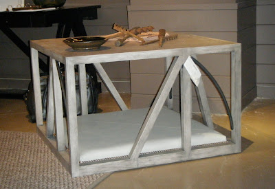
The “Math Lesson” table features a built in dog bed.  It is a gorgeous mix of natural wood, dark metal, and leather.  Wouldn’t it look just charming with your little furry friend inside?!


Low and sleek, this wooden table has an eye catching mirrored niche in the middle, perfect for floral arrangements, wine bottles, magazines, etc.


Vintage trunks are incorporated, as coffee tables, into eclectic room themes recalling the era of luxury extended travel.  This modern take on the traditional trunk is fresh and functional.


Interesting objects from the vertical axis, like this French road sign, function beautifully on the horizontal plane as table tops.   This sign is an example of the current "travel" theme resonating through  designer showrooms.


We never get tired of the Greek key motif.  Its sculptural geometric qualities add dimension to the quiet, calm, neutral themes prevalent in our hurried era.