Showing posts with label Century Furniture. Show all posts

Friday, April 26, 2013

Junior League of Greensboro Show House 2013 Sponsored by Traditional Home Magazine: Miles Redd's Grand Reception Room.

We arrived for the press breakfast at Adamsleigh, the unbelievable remnant of the American Country House Movement, to view the resurrection of a home that had been virtually untouched since 1930. To read our last post on the architect, Luther Lashmit and other artisans on the property click HERE.


I showed the main reception room in the previous post, but wanted to juxtapose the dramatic Miles Redd, Oscar de  la Renta Century Furniture transformation. 


While we can see that Arthur Cassel Griffin, the original designer was adhering to the antiquarian precedents of an ancient structure, Miles Redd relevantly applies a graceful Chinoiserie style throughout the room. Open fretwork Oscar de la Renta chairs are ingeniously placed in the central area of the room allowing a clean, homogenous visual sweep of the room. 


Parsing the large space with a central table and chairs creates a functional gathering area maintaining the characteristic airy Chinoiserie effect without sacrificing the density of seating required for large receptions. Flow throughout is achieved by the repetition of the branching patterns on the rug, fabrics, wall panels, that the fretwork chairs echo. This room becomes engaging and complex by Redd's masterful mix of blues, complementery orange, bold large scale ceramic pieces and architectural pediments. The original architect, Luther Lashmit, had a predilection for octagonal windows, so Miles Redd nailed the vernacular in his mirror selection above.  

This is a characteristic octagonal window in a friend's Lashmit home in Winston-Salem. Many of the surviving homes feature this signature flourish. 


Early mid-century lighting combined with a modern abstract painting convey a light-handed sense of continuity and the evolution of decor over generations. This market more than any other market in years, reiterates a luxurious aesthetic through rich tactile fabrics, carpeting and precious veneers. Chinoiserie, popular since the 17th century French infatuation, has never gone out, but is more visible in the showrooms and has been reinterpreted by many designers. Where did we find the look around market? Let's start with Mary McDonald's beautiful linen chinoiserie wall panels. 


Chelsea House had a wide array of Chinoiserie on hand for buyers, as has been their tradition for decades. 


The prices are unbelievable!! 


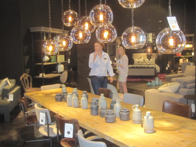
Christine and I are never tired of Alexa Hampton's Susanna Table. Hickory Chair is a custom manufacturer, so we love seeing what Alexa does with this piece every market. Don't you love how you can add notes to your images in Google+?


Bungalow 5 speaks fluid Mandarin and Cantonese in their well curated line and demonstrated how to use it with neutrals several markets ago. Here is what they've got going on this market!

Bungalow 5 High Point April 2013

Worlds Away
Liz Gray of HGTV's Design Happens blog and I chatted about our collaboration on a Worlds-Away giveaway for the Feebie Friday post. Worlds-Away does a fantastic job with modern interpretations of Chinoiserie fret work, lacquer and pagoda designs. Finally, I have to say Mirror Image Home has a premium line of Mirrors with design legends Bunny Williams and Barclay Butera. We were delighted to find them in Market Square Suites and look forward to adding these items to our online store. 


We Have Thousands of Beautiful Items to Choose from in Our Online Store!
If You Don't See That Special Item Online
Call Us and We Will Help You Find it!

336-705-1316


Sunday, November 11, 2012

What's New at High Point: Blue and Orange With Bold Graphics

PANTONE 2012 Color of The Year:

Pantone 17-1463 Tangerine Tango 


This interior scheme by Janie Molster fuses everything fresh in High Point design trends. I have had orange in my schemes since my first apartment. I am delighted by its resurgence. It is only a chutes and ladders slide across the color wheel to bring up its dynamic cool blue opposite. It is a fluid addition. The colors, combined with the geometric carpet,  with muscular color blocking on the draperies makes this room a hit.  
Pantone #1 color of 2013 is Monaco Blue

Lillian August has a spectacularly merchandised showroom at High Point, and this luscious new Karl Buffet styled with bold geometric fabric further illustrates evolutionary patterns in home decor. Karl gets my buffet of the year vote. I covet it. Traditionally, people have shied away from orange in design schemes. I don't know why, as it works beautifully with so many different colors. When choosing color ideas for rooms, it helps to look at china or fabric patterns that you love. 


Mottahedeh had fabulous bright gold and orange settings. 


These are my colors. Notice the blue and touches of black against the clean white background. 
Why, oh why did I not buy this?


If the recessionary griege has gotten you down, you can see how orange accents energize a sluggish monotone. This new Amy Howard chair is the best new upholstery piece at market.


Notice the equestrian pillow. Equestrian is always an undercurrent, but it is resurfacing. The zeitgeist is this Hermes orange floating through design. Don't forget Hermes started as a harness shop in 1837. For many of us, orange is the color of luxury and time honored tradition. For me, it is also a Palm Beach staple, and a look I love. 


Thibaut is new to High Point and their new furniture line is dressed in orange, neutrals and blue. They were awarded the best bed at market award...
                                                                           by me!


Again, bold crisp blue exploded geometrics define this space. A smaller scaled organic leaf pattern fabric cozies it up. Maybe I've been under a rock, but for me pendants as bed side lighting is new. Please weigh in on this question in the comment section at the bottom of the post.  I've gots to know. 


Global Views Arabesque rug continues to get head swivels from me each market. I love how their showroom designer paired it with the geometric in the cocktail and side tables. You could have a cigarette and a martini in this space. Century Furniture went all out with the color story this market.

Here is another version of the orange (fire)/blue (water) interplay with turquoise and oranges. The testosterone present in the robust scale and geometric shapes of the furniture is balanced with the precision of an endocrinologist. The estrogen is the painted finishes, lacquers and curves. Great design has restrained tension. Great design produces an alchemical endorphin flow, which is why we are all addicted to it. The American players can still custom finish your furniture in any paint color you can imagine. Hickory, North Carolina is back on the fashion map--I kid you not. 


A 60's pink and orange combo goes urban in Century's High Point showroom with an unexpected pairing of these uber chic chaise lounges. It is another great example of dynamic yin and yang in virtuoso design. The upholstery is curvy and sexy. The undertone is neutral, but the architectural nature of the case goods combined with bold color blocking on the curtains keeps everything in balance. This space has both strength and harmony.  Color blocking has been a fashion staple for years, but we are seeing more and more of it in interiors.


Suzanne Kasler has known this trick for a long time. 


In her book Inspired Interiors with Christine Pittel,  Suzanne Kasler's use of bold color blocking on a very feminine piece balances out this vignette in a pleasing way.


What is orange, gray and graphic? 
Notice the fabulous x benches with a smaller graphic pattern defined with orange trim-- best in show. 


This exuberant hand hooked carpet by Safavieh shows how many colors work well with orange and gray. I will add, in addition to color and graphics, design is happier and more youthful than it was during the recession. I know Restoration Hardware is sticking to that story, and it is undeniably a very popular look, but femininity is balancing out that act. I am hoping it is a leading indicator! You can tell what I love by my living room. It has made me happy everyday since 2002!! Orange you glad! 


I like it so much, it became my logo. 


Come by and view our new market additions

More Later!! 
Liz


Wednesday, October 31, 2012

High Point Market October 2012 Report

We had some technical issues last week which sent our High Point report back a bit. Also, we are dealing with Google shopping's major paradigm shift. For those of you with shopping carts attached to your web site,  Google no longer accepts product feeds for free. In other words, there is no such thing as a purely organic search on Google shopping. It is 100% pay to play. Think about it when you are shopping. With that out of the way, we can talk about design directions at the High Point Market. Most bloggers have remarked about the re-emergence of color. I could do an entire post on orange. My favorite color is all over the showrooms, much to my delight.


This vignette at Century says it all.  Complementary oranges and blues are combined with the chic midcentury exploded graphic, seasoned subtly with Asian references. We are seeing way more outdoor furniture, lighting and accessories creeping their way into interiors, which I think is the smart new take on eclectic design strategies. This Richard Frinier group is singing arias to me lately. A client and I stalked for years seeking the perfect scale, design and tone for her new terrace . We bought this line on the spot and it looks amazing with a tortoise shell finish. While Century furniture is not inexpensive, I think the price is a value for generational furniture.


My client's chickens loved it too! They have since been banished to the country. 


I digress to share an irresistible chicken snuggle moment. 

The way vendors are showing pendants grouped together has an alfresco feel to me. Lighting is hard to photograph so bear with me. 

Mason Globe Pendants in hand blown glass

I would say, as simple as this arrangement is, this was my favorite casual lighting vignette. It brings a romantic summer candlelit glow indoors. The industrial filament light bulbs remind me of fireflies. 

Barn lights in varied shapes, again take the place of a large piece. 

Moroccan lanterns reflect an exotic garden glow in this transitional space. Travel and exotic plunder elements have been design stand-by's as long as time. It will always be a stylish dimension in any setting.

In accessories, obsolescence as a collectible concept  is picking up speed. Nostalgia for the mechanical and non digital continues to populate the edgier showrooms. Repurposing has been in vogue for a good twenty years, but its been expanding exponentially for at least the last 5 years in High Point. Let's face it, junk eventually converts to treasure and the operative word is--collectible. Keep your old records and turntables if you are old enough to have them. 


 George Baylor, Noir Furniture owner, designer and showroom stylist drives this trend home.  


All of this is making me feel like a fossil. Here is a fun hotel spoon chandelier we put in a client's pantry last October. I first saw this concept  at Francine Gardner's stunning New York space, Interieurs. Jose Estevez's energetic creativity has filtered into the U.S. market. His brocante (flea market) line is the real deal. Here is the Cake Vintage interpretation. 


Four Hands
We noticed that our main clientele for the rough flea market look are men. There are exceptions, but these showrooms have a lofty, masculine focus, which begs the question of decorating for Mars and Venus. 


Cleaned up industrial and mid-century are more to my liking


Wesley Hall had the best x-stools--ever. Gray and orange continue to crop up in the showrooms.
We have lots more photos, so...
More Later!!

Here is my Halloween Pinterest contribution!!

When entertaining on Halloween, be sure to wear a lot of makeup!
I was a big fan of the Klutz Press makeup kits.

If you see any market photos that you would like to order,
don't hesitate to call

Dovecote Decor
336-705-1316