Tuesday, December 18, 2012

Empress of the Eye Selects her Favorite Design Finds in Dovecote Decor's Online Store

What a happy little Holiday surprise we had at Dovecote Decor, when we discovered Jane Schott, from Empress of the Eye had written a comprehensive post on our online store. We are so flattered and grateful for her thorough research and the time she spent sifting through over 1,400 SKUs.to find her favorites.


We know what our clients buy, but it is fun to see what The Empress distills from our years of shopping. Jane and I have shopped the Dixie Highway together and had the time of our lives, or at least mine. Here is a little tickler from Jane's line.


The operative words here are: "Out of the box--with taste." Jane was inspired to create this pillow from a book jacket, marrying typeset, graphic pattern and message. Her designs are limited editions, and you never know what Jane will do next.
Click Here
To see Jane's faves! 
Click Here
To follow us shopping down the Dixie Highway!
More Later!!


Thursday, December 13, 2012

Christmas Decorating 2012: Let the Wild Rumpus Begin!

There is nothing like a good deadline, or should I say party, to get the house decorated for the Holidays.   Our BookMarks Festival of Books is an organization near and dear to my heart and I am their party venue. It is a selfish volunteer job. Once a year, when the 40 or so top authors in the country come to town for our literary festival, they come to my house. We literally have had everybody who is anybody, for an intimate literary salon. This year a highlight was Gillian Flynn author of Gone Girl  while she was #1 on the New York Times Best Seller List!


For anyone who has read Gone Girl,  let's just say Gillian was killer. For all the people that make BookMarks Festival of Books happen, we have a Holiday soiree as a respite from the business of begging for money and authors. This year I have the most beautiful fat 10 foot tree--ever!


I have been collecting Christmas decorations for over 30 years. If you read my last year's Christmas post, my friend Mrs. K. has 3 generations worth and the collection is spectacular. Walking in the front door....


Dovecote can not resist an avian themed mantle.


As usual, everyone brings a little nibble. The food was delicious. When everyone brings their specialties, the food is stellar. 


Like Elizabeth at Pretty Pink Tulips, I opted for Magnolia and Holly in our family room mantle. Do visit her outdoor decorations they are sumptuous.

May Your Days Be Merry and Bright!
Our Clear Star Chandelier is hot hot hot!!
Visit our online store for more Holiday ideas


Monday, December 3, 2012

Post Time: Equestrian Design at High Point

For all our horse lovers out there, we have good news for you from High Point, North Carolina. There is a specter haunting design and the specter is equestrian. We are seeing it in art, fashion and interior design. Cultural motifs ebb and flow, bubbling up from the effluvial  social, economic, political and  media shores. As an undercurrent, trend is a fascinating. It is not a whimsical branding show derived from powerful operators. In a transient world, trends move fast, but are they shallow, enduring, reliable...predictable? Trends are zeitgeist; the spirit of an age or a time or... a reaction.
Equestrian motifs continue to crop up all over the show rooms. The first hint was in fashion, as designers from all over the world were wearing riding boots, leggings and well tailored jackets.


In fact, the fall 2012 collections of Ralph Lauren, Tommy Hilfiger and Burberry lines are all sporting equestrian themes. 

Ralph Lauren's leather, plaid and boot combo hits all the right chords for this look. As I mentioned in my last post, an alfresco breeze is picking up speed as a common denominator. Equestrian style denotes nature, fresh air, power, and discipline. I think we are all longing for those qualities. I know I am!


Burberry Fall 2012

In case you missed my last post, Hermes orange is all over design town fanning the flames of equestrian motifs. 


We ran into Julie Browning Bova at Hickory Chair, who has a stunning equestrian inspired line at Stanford furniture and chatted with her in front of a video camera--hope it hits the cutting room floor. This is my adorable client (left) posing with Julie. I'm camera shy.


Julie was a great person to interview on equestrian revival, if you could call it that. She's the real deal. As a rider, Mother of four riding children and a designer, Julie fuses her life passion with decor. Any time you take a theme and over do, there is a cloying sense of too much. There is a way to employ a classic style. Julie's classic equestrian elements can combine to create a pleasing, balanced and comfortable room.


The English country house look never gets old. But a punchy fresh fabric on a traditional piece keeps it fun. 


This ottoman sports the classic horse bit. Has Gucci ever discontinued their classic loafer? 


What are the elements of great English style? Here is the list: Lanterns, large analogue clocks, horse paintings, leather, nailhead trim, black or dark trim, bits, stirrups, leather, and plaid. Julie's stirrup coffee table is a handsome addition to any room.


This needlepoint rug is not over doing it for me. In fact, it would look terrific layered under this coffee table.


The detail of the harness motif and the different blankets on all the horses makes this one a winner. Add an Hermes orange and brown border and you've hit the trifecta.
French Market Collection


This buggy bench reminds of us kinder gentler times. It would be a wonderful mudroom perch to pull off your wellies.
Van Thiel


Typography is still a mainstay in both art and furniture. We noticed as we shopped the showrooms, a nostalgia for the pre-digital age is permeating the scene.

Ralph Lauren has infinite variations on the equestrian motif. You can take it Brit, Western, or Indian. In his own dining room, an elegant chandelier is balanced against an informal collection of equine photographs and paintings that appear to have grown organically over time. 


There's a wonderful security and sense of continuity in these layered rooms.


The late and incredibly talented Naomi Leff, known for her spectacular retail spaces, notably the Ralph Lauren Rhinelander Mansion renovation, designed this striking iron and glass bit motif door with a curvy art deco flourish.


Our equestrian enthusiasts love, love, love the Dovecote Decor Saddle Chair

Don't forget to visit our online store
for some fun Holiday gift ideas!!


And a big Happy Birthday to my special girl!!


Posing beneath one of our favorite equestrian landmarks


Sunday, November 11, 2012

What's New at High Point: Blue and Orange With Bold Graphics

PANTONE 2012 Color of The Year:

Pantone 17-1463 Tangerine Tango 


This interior scheme by Janie Molster fuses everything fresh in High Point design trends. I have had orange in my schemes since my first apartment. I am delighted by its resurgence. It is only a chutes and ladders slide across the color wheel to bring up its dynamic cool blue opposite. It is a fluid addition. The colors, combined with the geometric carpet,  with muscular color blocking on the draperies makes this room a hit.  
Pantone #1 color of 2013 is Monaco Blue

Lillian August has a spectacularly merchandised showroom at High Point, and this luscious new Karl Buffet styled with bold geometric fabric further illustrates evolutionary patterns in home decor. Karl gets my buffet of the year vote. I covet it. Traditionally, people have shied away from orange in design schemes. I don't know why, as it works beautifully with so many different colors. When choosing color ideas for rooms, it helps to look at china or fabric patterns that you love. 


Mottahedeh had fabulous bright gold and orange settings. 


These are my colors. Notice the blue and touches of black against the clean white background. 
Why, oh why did I not buy this?


If the recessionary griege has gotten you down, you can see how orange accents energize a sluggish monotone. This new Amy Howard chair is the best new upholstery piece at market.


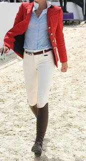
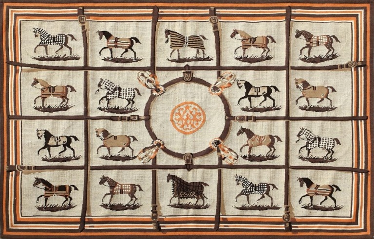
Notice the equestrian pillow. Equestrian is always an undercurrent, but it is resurfacing. The zeitgeist is this Hermes orange floating through design. Don't forget Hermes started as a harness shop in 1837. For many of us, orange is the color of luxury and time honored tradition. For me, it is also a Palm Beach staple, and a look I love. 


Thibaut is new to High Point and their new furniture line is dressed in orange, neutrals and blue. They were awarded the best bed at market award...
                                                                           by me!


Again, bold crisp blue exploded geometrics define this space. A smaller scaled organic leaf pattern fabric cozies it up. Maybe I've been under a rock, but for me pendants as bed side lighting is new. Please weigh in on this question in the comment section at the bottom of the post.  I've gots to know. 


Global Views Arabesque rug continues to get head swivels from me each market. I love how their showroom designer paired it with the geometric in the cocktail and side tables. You could have a cigarette and a martini in this space. Century Furniture went all out with the color story this market.

Here is another version of the orange (fire)/blue (water) interplay with turquoise and oranges. The testosterone present in the robust scale and geometric shapes of the furniture is balanced with the precision of an endocrinologist. The estrogen is the painted finishes, lacquers and curves. Great design has restrained tension. Great design produces an alchemical endorphin flow, which is why we are all addicted to it. The American players can still custom finish your furniture in any paint color you can imagine. Hickory, North Carolina is back on the fashion map--I kid you not. 


A 60's pink and orange combo goes urban in Century's High Point showroom with an unexpected pairing of these uber chic chaise lounges. It is another great example of dynamic yin and yang in virtuoso design. The upholstery is curvy and sexy. The undertone is neutral, but the architectural nature of the case goods combined with bold color blocking on the curtains keeps everything in balance. This space has both strength and harmony.  Color blocking has been a fashion staple for years, but we are seeing more and more of it in interiors.


Suzanne Kasler has known this trick for a long time. 


In her book Inspired Interiors with Christine Pittel,  Suzanne Kasler's use of bold color blocking on a very feminine piece balances out this vignette in a pleasing way.


What is orange, gray and graphic? 
Notice the fabulous x benches with a smaller graphic pattern defined with orange trim-- best in show. 


This exuberant hand hooked carpet by Safavieh shows how many colors work well with orange and gray. I will add, in addition to color and graphics, design is happier and more youthful than it was during the recession. I know Restoration Hardware is sticking to that story, and it is undeniably a very popular look, but femininity is balancing out that act. I am hoping it is a leading indicator! You can tell what I love by my living room. It has made me happy everyday since 2002!! Orange you glad! 


I like it so much, it became my logo. 


Come by and view our new market additions

More Later!! 
Liz